At first glance, the concept of +yaw seems quite simple: get road data, do some math, and arrive at a simple number that can be applied across all roads(YawRate), and make it searchable. Perhaps it was my early 20s naïveté that assumed it would be easy enough to throw together in a few months and make it work. PositiveYaw is currently on (approximately) the 15th iteration of the YawRate algorithm, and as of 2018, it’s been rebuilt from the ground up 5 times on 3 different services. That’s a post for another time—but I do want to spend some time on where we are today, and a broad overview of the tweaks we’ve made to determine how good a road is to drive
The beginning
When PositiveYaw first started, the technique we used to find roads was pretty elementary. We didn’t do a lot of math on road features, but we told you how far you had gone in a straight line versus how far you had actually driven. Basically, the worst way to determine how run roads are to drive. It meant that a short road with two or three 90 degree left turns was “amazing” on paper, but a long road snaking in different directions was actually more fun to drive. Moving on from this, we started doing some analysis on the angle changes on each road. Instead of just a ratio, we could calculate how curvy a road truly was—this gave us a lot to think about.
Discovering issues
However, with this breakthrough, there were issues: Some roads have convoluted data behind them. Part of the struggle of dealing with open-source projects is that data isn’t always what you expect. We use OpenStreetMap. Check out this representation of a road on a map:
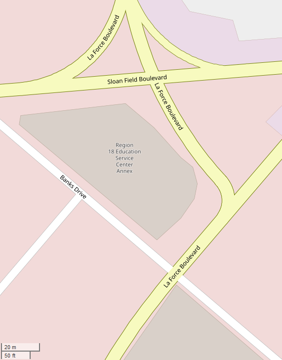
Let’s focus on La Force Boulevard. It looks fine, right? Here are the GPS points that actually give the road its shape on the map, shown as dots in Tableau:
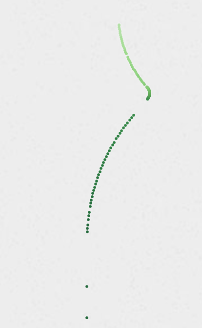
Let’s look at it a little closer on this main curve:
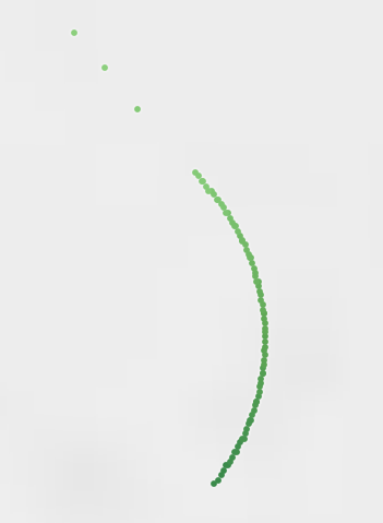
And still zoomed in more…
Checkout how the points zig-zag to form a curve. If someone views an extremely zoomed in version of this map, it’s not hard to understand—the representation of this road is fine. Programmatically, however, it’s a nightmare. Humans can look at this and clearly identify that the road doesn’t zigzag as it curves. A program has to be specifically designed for issues in data like this.
This data is stored in our database as a list of latitude and longitude points. We use this data to determine a road’s curves, straights, and generally profile a road. Viewing this road as list of GPS points is hard to understand how everything comes together, so here you’ll understand why we use data visualization to wrap our heads around a list of GPS points. Let’s dive deeper into the visualization to understand what is truly going on.
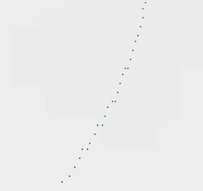
In the image below we’ve added color to left and right turns to clarify them. Color or direction doesn’t really matter, as it depends which way one would travel down the road. The starker the color, the sharper the curve. The larger the dot, the tighter the “radius.” Check it out:
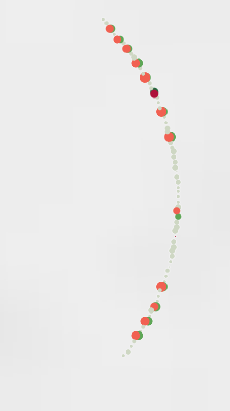
This is similar to what PositiveYaw’s (previously) rudimentary way of programmatically checking road curviness would see. Remember, our revised method simply checked to see all direction changes when traveling down the road’s points(and the road is comprised only by these representative GPS points). It was clear that this version of the YawRate algorithm was going to say this road was amazing. And it did. This road, which in reality has only one ~90 degree turn, ranked nearly 15x better than any other road that had ‘good data.’
In the first attempts to fix this, we used band-aids adhesive bandage solutions which didn’t actually fix the issue, only hid the problem. The ultimate solution is to continue to revisit the problem and consistently improve upon the last version’s issues. The YawRate algorithm is revised about once a year.
The problem
Now, we need a real solution to this ‘bad data’ issue. However, to fix it, we must understand the problem. To figure out a way to combat it, we use our data visualization tools and discussion to determine the problem(s). Through discoveries in visualizing the data and identifying similar roads, we found that there are a few core problems with some data:
- Radius of a curve is smaller than what is “possible” for a road’s curve. If we continued a curve into a circle, it would form a circle smaller than 3 feet (1m). This is simply not possible, as usually a road’s width is at least a multiple of this
- Lefts and rights cannot actually happen in such quick succession, but it is possible that GPS data has some ‘faux’ points that, in aggregate, still create a cohesive curve. The road showcased in this post (La Force Blvd) is a perfect example.
- We cannot assume that road data is bad or good simply based on a few criteria. It is a complex issue that probably cannot be solved with a rule of thumb.
The solution
Is the solution to start with clean data? In reality, this will never happen. We’ll discuss the solution in another blog post.
At the time of writing, PositiveYaw indexes over 2.1 million road segments, comprised of nearly 36 million GPS points. The amount of roads affected by this problem is likely less than 0.01% of the roads indexed. If you’d like to checkout roads near you, search our database of roads at https://app.positiveyaw.com
PositiveYaw is free because of you.
Sifting through data takes a long time, and PositiveYaw is a result of years of dealing with small issues like this. We hope you enjoy the work we’ve done enough to support us.
Keep it mellow, don’t cross yellows.
-Jackson